So, things have changed around here. I’ve added a header on this blog to give you a little bit more context for what this page will be about. here’s an explanation…
1.
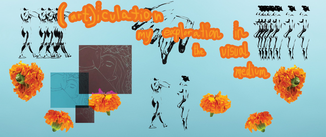
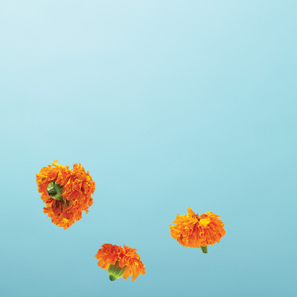
My header image uses a combination of bold colors, sketched images, and handwritten text to convey that this blog serves as a collection of art, as well as my own personal voice surrounding art. It uses an intentionally “messy” aesthetic in its placement of images to suggest a hand-crafted image, one that could’ve been created on a piece of paper. This image notifies my audience (you, the reader) that I intend to cover topics of art and visual creations.
2.
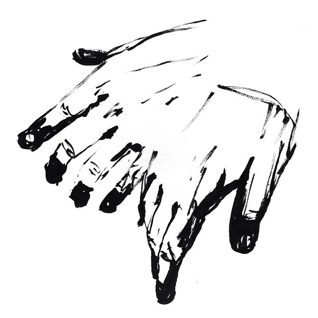
“Hands and body sketches” by Clara Clarafosca is licensed under CC BY-NC-ND 4.0
“Reel Asian Film Festival 2013” by Brian Banton is licensed under CC BY-NC 4.0
The images I used are licensed under Creative Commons, which is a service that allows for artists and creators to upload their media to a sharing platform and license it for specific usage. Most Creative Commons images are allowed to be repurposed for non-commercial usage, such as for my website header!
3.
I used Photoshop to create this image. It contains a total of 22 layers. I used this image-
-as my starting point for my color palette. I then duplicated these images-
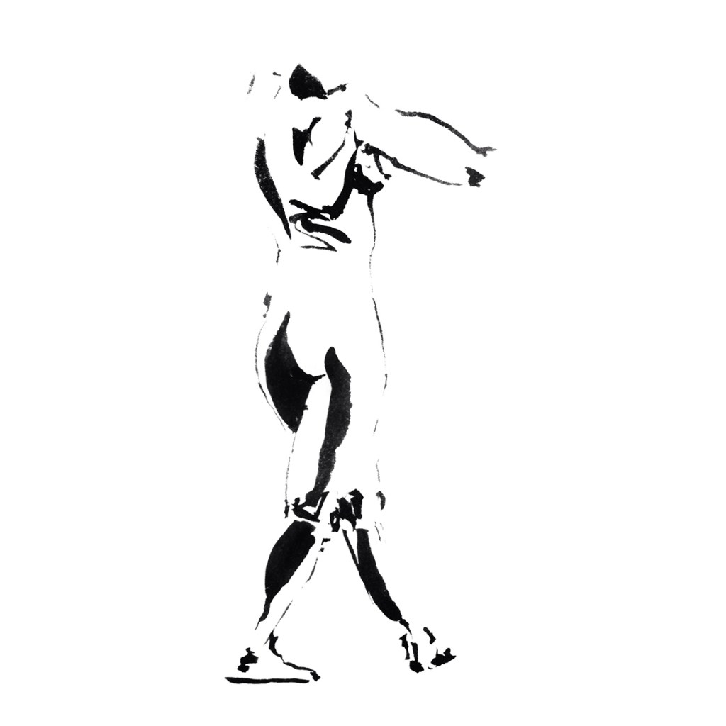
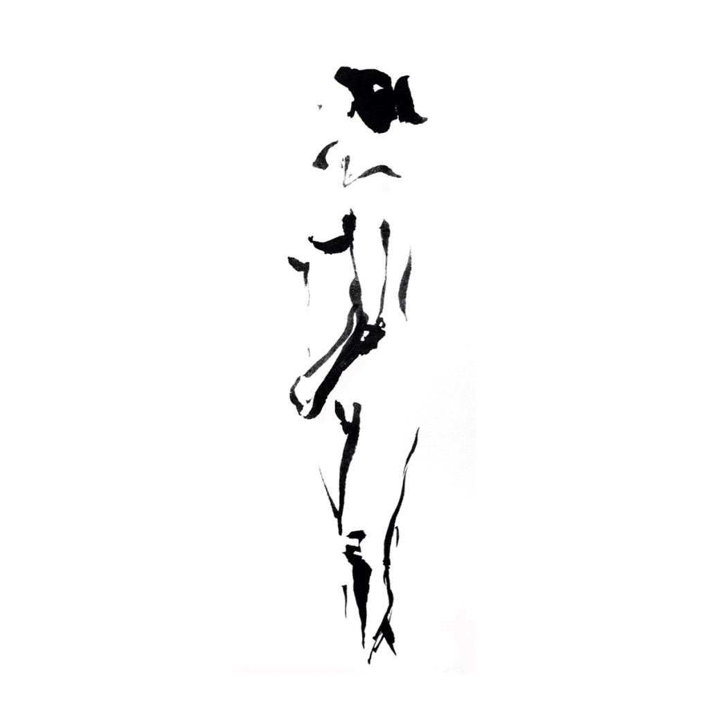
-through multiple layers to create dimension and the concept of motion. These images naturally have solid white backgrounds but I used transparency tools to render the background clear against the colorful backdrop. I then added my website title and subheading, which I knew I wanted to create a handmade, but also intense feeling with. I managed this through thickening the outline on the text that I painted. I also uploaded a personal sketch of mine and multiplied it, inverting the colors as well as playing with size and transparency.
4.
My image- having 22 total layers- is obviously more complex than what could be created on a single layer bitmap on Microsoft Paint. Several effects I applied- such as duplication, thickening, applying patterns, inverting colors, and moving around layers- would not be possible. However, one similarity is my decision to hand paint my blog title- this is an effect that could actually be mimicked in Microsoft Paint.
Here’s a song I was listening to while I created this header. enjoy xx
